Steady as she goes

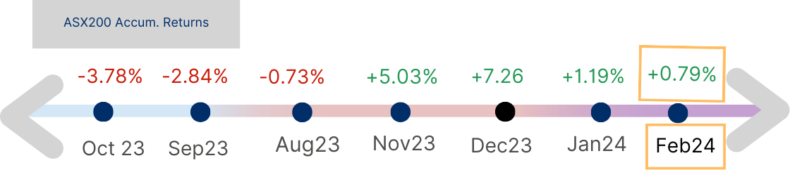
Figure 1: Stock Market Scale
Acuview Feb 2024
The month of February was about “old” highs being smashed and new highs reached. Let’s take a look at What’s been going right and what needs to be right for us to be alright.
It's Rich
Currently both the 12 month forward PE ratio of the S&P 500 and ASX 200 are trading above long term averages.
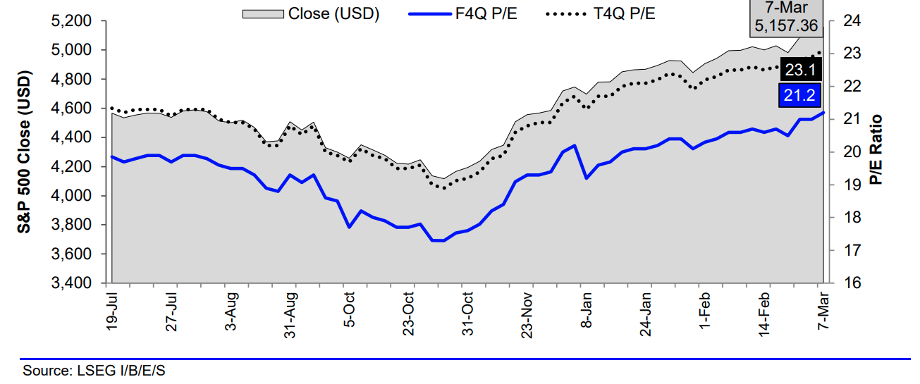
Chart 1 : S&P 500 Composite (.SPX) Three Month Close and Forward 4 QTR (F4Q) & Trailing 4 QTR (T4Q) P/E History
S&P 500' ‘s forward PE ratio on 8 Mar was 21.2x (Chart 1). This is above its 5-year average of 18.9 and 10 years of 17.7x. Was that justified?
US companies reported well for the Dec quarter of 2023 with an earnings improvement of 10% compared to the same quarter last year (Chart 2). If compared to the 4 last preceding quarters’ growth (of Q323+7.5%, Q223-2.8%, Q123+0.1%, and Q422-3.2%), it looks even more impressive. So, investor optimism can be understood from that perspective. Compared to the earnings of calendar year 2023, the PE ratio was at a higher rate of 23.1x (Chart 1). So, one with a positive bias can argue that US shares are now 2 points cheaper than 12 months ago due to higher corporate earnings. Obviously, the earnings upward revisions are not evenly recorded across sectors. The four sectors that benefited most from upward revisions were healthcare, technology, consumer discretionary, and Industrials (see Chart 3).

Chart 2: S&P 500: Q4 2023 Share-Weighted Earnings ($B)
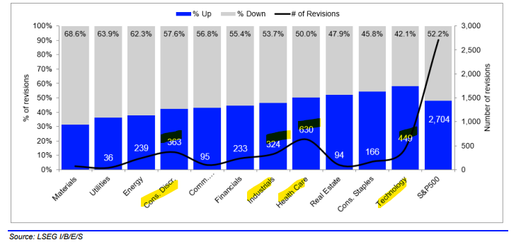
Chart 3: All U.S. Companies: Weekly Earnings Estimate Revisions by Sector
What About Australia?
ASX 200 is similarly trading above its long term 15 year average of 14.6x. Its PE ratio has increased from the previous quarter (of 16.4x) to a higher of 16.8x for week ending 8 Mar 24 (Chart 4). Unlike the US this came at the downgrading of earnings revisions (Chart 5). Consensus one year forward Earnings per share (EPS) growth of ASX 200 companies has dropped from 7% prior to reporting season to the latest of 5.5%.
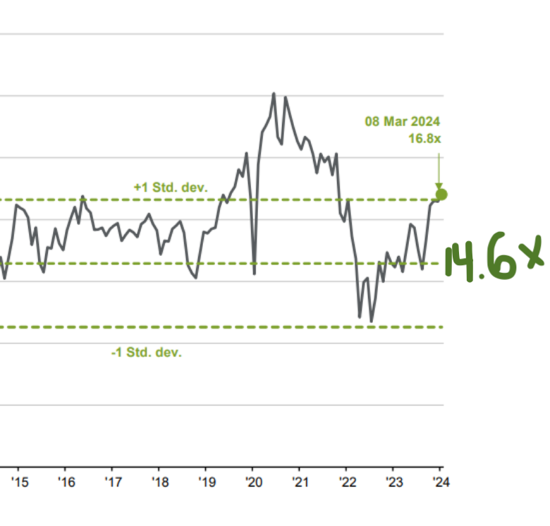
Chart 4: Forward P/E ratio of ASX 200 Index; Source: : FactSet, Standard & Poor’s, J.P. Morgan Asset Management. Guide to the Markets – Australia. Data as of 08/03/24.
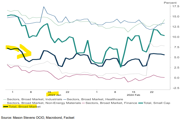
Chart 5: ASX200 EPS growth downgraded since Dec 2023
Chart 6 shows the consensus earnings revisions of various sectors with the top 3 upgraded sectors highlighted. They were Technology and counter-intuitively the Energy and Material sectors, the sectors which had been experiencing share price weaknesses in February (Chart 7).
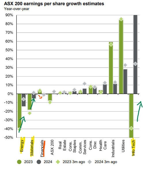
Chart 6: ASX 200 earnings per share growth estimates; Source: FactSet, Standard & Poor’s, J.P. Morgan Asset Management. Guide to the Markets – Australia. Data as of 08/03/24
The sector that stood out in share price counter moves is the Financials, where though the sector copped a consensus downgrade in EPS (Chart 6), share prices have performed strongly (Chart 7). In the current quarter so far, the big four have clocked up returns of between 15.6% (WBC) to the lowest 3.95% (CBA) at the time of writing.
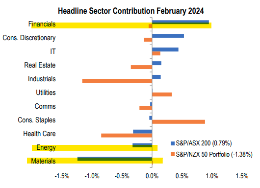
Chart 7: ASX 200 sector contributions; Source: Source: S&P Dow Jones Indices LLC and/or its affiliates. Data as of February 29, 2024
Moving ahead towards the next quarter, as an active manager, we would be more reticent of putting more money towards the banks but would remain for their upcoming dividends. In the options space, an attractive strategy is the selling of call options over bank shares. The investor holds on to the shares for dividend and franking credits upcoming in May whilst earning an extra lot of income from options premiums. For example, writing a Jun24 $30.74 strike ANZ call gives an estimated 40c premium which is about an extra 1.3% over a $29 share price (please note Target Market Determinant disclaimer below).
Income-boosting strategies will help pump up overall portfolio income, particularly with the overall ASX 200 dividend yield currently at 3.8%, running below long-term average of 4.6%. See Chart 8 depicting a currently falling Dividend Yield.
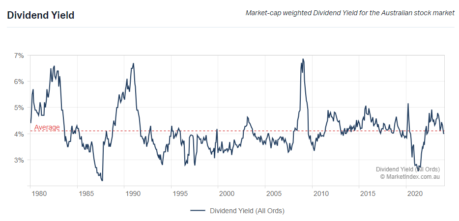
Chart 8: ASX Dividend Yield, 14/3/24; Source: https://www.marketindex.com.au/statistics
How's Cash Flow Tracking for Corporate Australia
Looking at the latest P/CF* metric for the ASX 200 Index, we note investors had been paying more for good cash flow and even paying above their long term average (Table 1).

*P/CF = share price over next 12 months’ cash flow
Table 1: Price-to-cash flow ratio of ASX 200 companies, dated 8 March 24; Source: Source: FactSet, Standard & Poor’s, J.P. Morgan Asset Management.
This measure throws some caution in the wind for several reasons. First, investors are paying more for cash but lower earnings, Earnings yield for ASX 200 shares have been falling and is expected to continue (Chart 9). This is likely to be a combination of lower earnings and higher share prices.
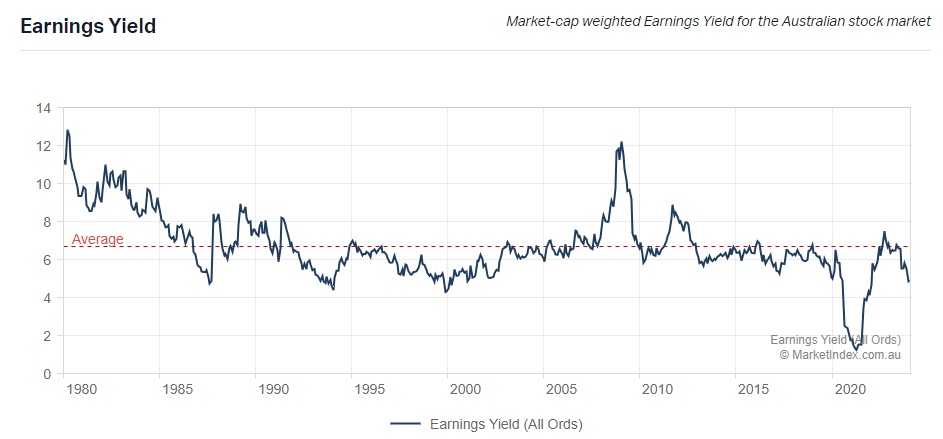
Chart 9: ASX Earnings Yield, 14/3/24; Source: https://www.marketindex.com.au/statistics
Second, investors are paying more over an undercurrent worsening credit position of businesses. CreditWatch has revealed record defaults in business-to-business payments in February (Chart 10), made worse by invoice values that are at record low. This is a double whammy on businesses. CreditWatch advises this is due to the direct impact of high cost pressures on businesses from higher interest rates, inflation, to wages and labour shortages coupled with lower consumer demand.
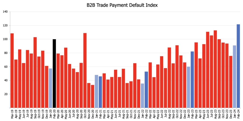
Chart 10: CreditWatch Business Risk Index; Source: CreditWatch
CreditWatch reckons there is a strong correlation between payment defaults and business failures. Businesses with one default has a 24% chance of being insolvent in the next 12 months and increases to 42% with two. The Business Risk Index data has been showing a rapidly slowing economy for sometime which has now finally dropped to the weaker GDP data in the December quarter (0.2%) which took the annual GDP growth rate to a weak 1.5%.
For listed share investors though, the direct impact of companies going into administration is not likely to be directly felt as the sectors that are most at risk are smaller businesses like those in the food and beverage sectors at highest risk with the financial and insurance services and health care and social assistance sectors least at risk of default over the next 12 months.
Let’s now turn to Australian household financial conditions.
Australian Household Balance Sheets
Wealthier on Paper
Australian households were wealthier by 3.6% in the Sep 23 quarter (according to latest ABS release). The majority of this wealth came from real estate values (dark blue bar in Chart 11) with a smaller percentage from shares, bonds, and deposits. Residential real estate value contributed to more than half of Australian household’s wealth (56.21%) with Australian listed shares and superannuation balances contributing 16.75% and 20% respectively in Feb 24*.
*Source: CoreLogic, RBS, APRA, ASX
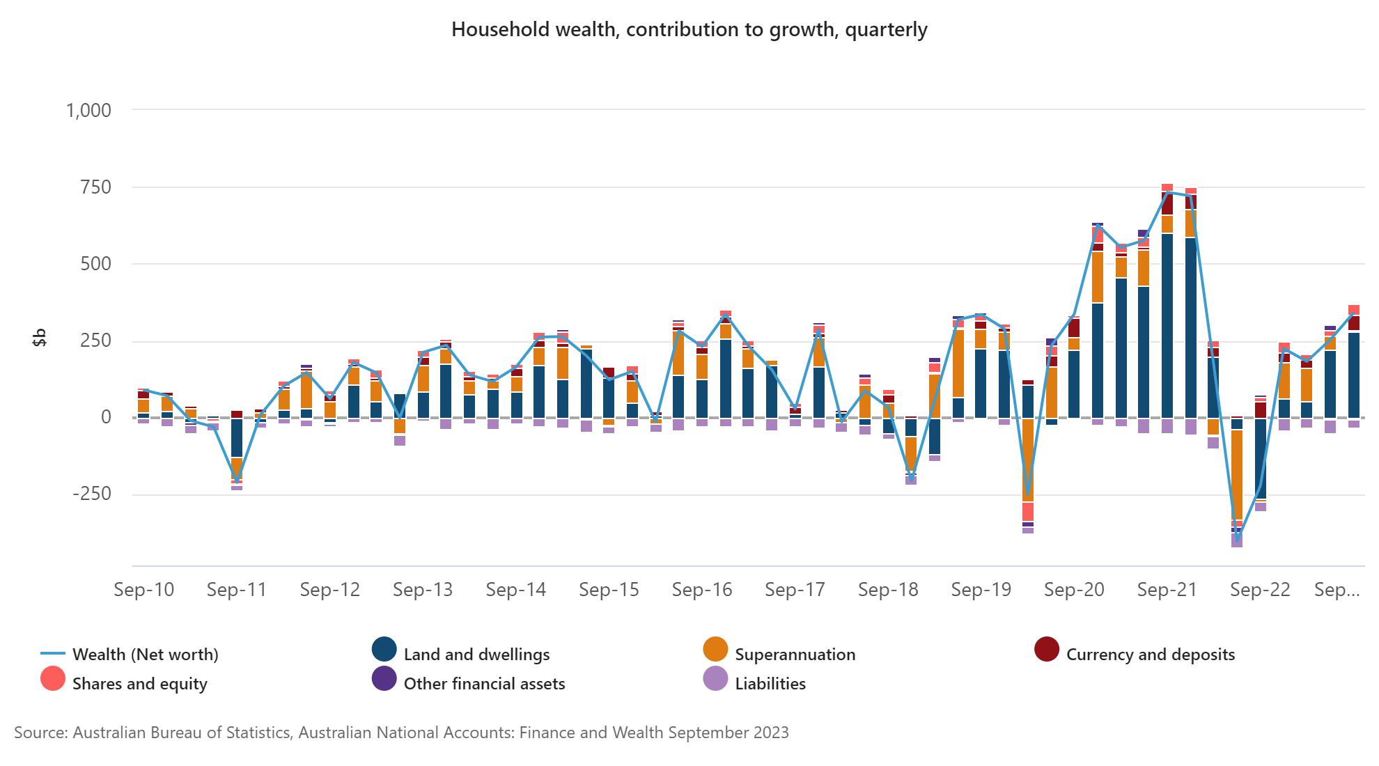
Chart 11: Australian Household wealth, contribution to wealth, quarterly Sep23 ; Source: Australian Bureau of Statistics
This wealth increase was aided by an average 8.9% increase in national dwelling value in the last rolling 12 months in Australia (CoreLogic), with Perth the highest at 18.3% and Sydney 10.6%. The split between capital cities and regionals are depicted in chart 12.
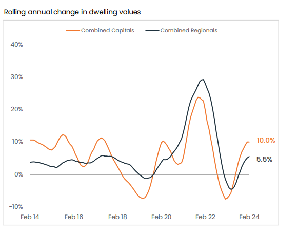
Chart 12: Rolling annual change in dwelling values; Source: CoreLogic, RP Data
Contrasting this to US households, equities had been a higher influence on household wealth. With real estate value rising at a slower pace and at a quarter of Australia’s (at 2.25%).
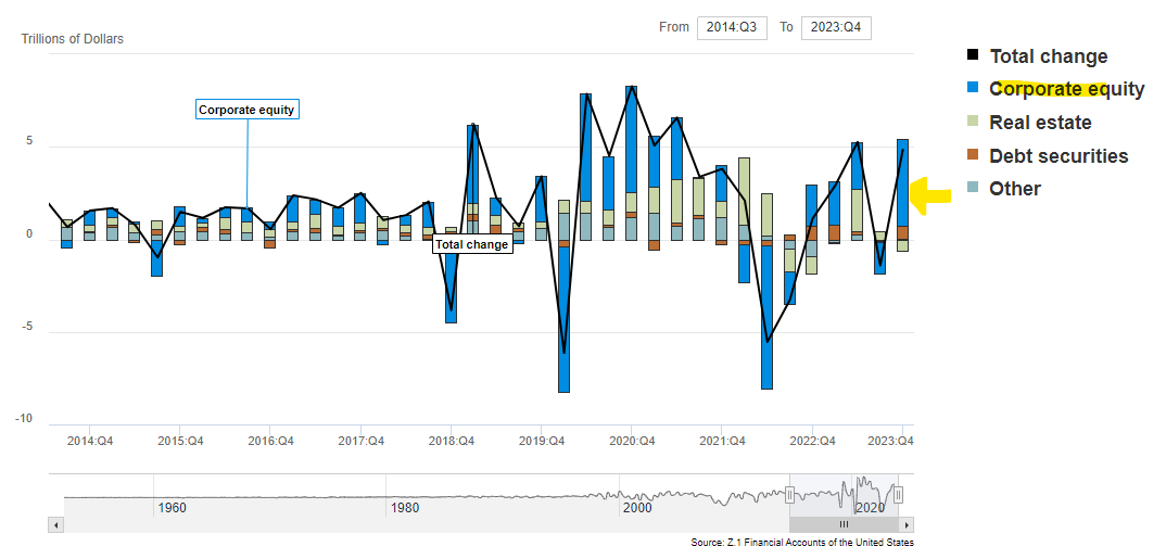
Chart 13: US Changes in Net Worth: Households and Nonprofit Organizations; Source: Z.1 Financial Accounts of the United States
But are we more in debt?
ABS’ latest Lending indicators in January 24 show an increase of 0.9% liabilities in the recent quarter. This is not from home loans despite rising property prices. Both new and existing home loans were lower by a total of 3.9% in the quarter (Chart 14), with average home loan balances falling from $624k to $615k (nationally).
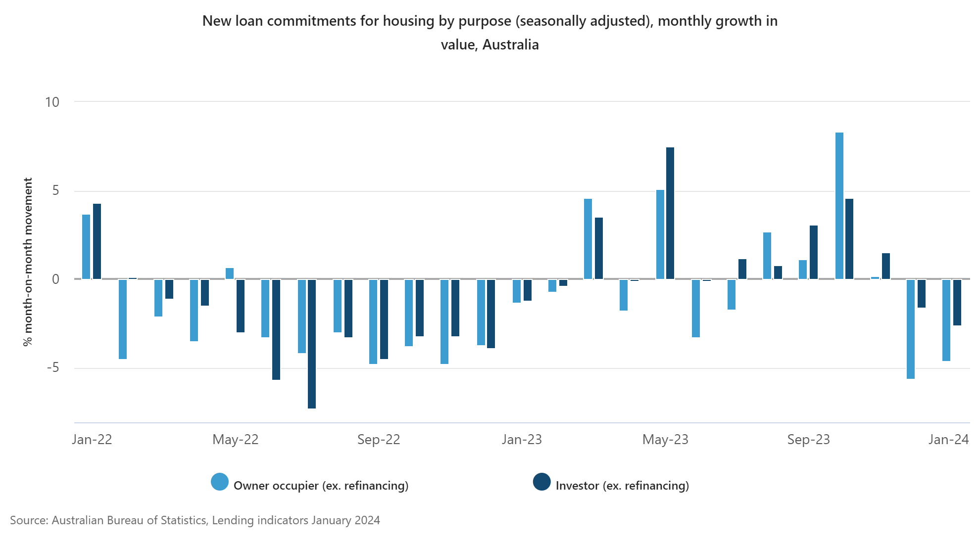
Chart 14: new loan commitments for housing by purpose (seasonally adjusted), monthly growth in value, Australia ; Source: Australian Bureau of Statistics
Mortgage repayments do eat up a big portion (and rising) of Australian household income. You will see from Chart 15 that Australian households pay a much larger percentage of household income towards mortgage repayments compared to many other developed nations. Australian households hold a much larger percentage of variable rate mortgage loans compared to the rest of the world as well.
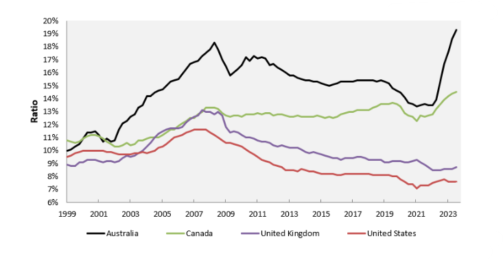
Chart 15: Debt Repayments to Household Income ; Source: MacroBusiness, Bank for International Settlements
Chart 16 shows how Australian households had been paying down home loans, by dipping into savings to fund higher mortgage repayments and reducing loan balances.
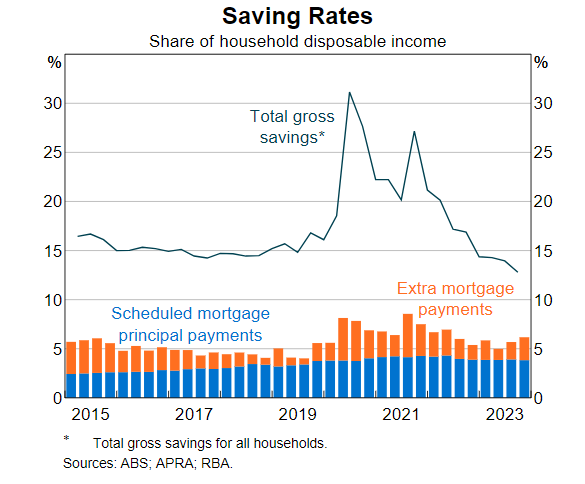
Chart 16: Total gross savings for all househlolds
One major contributory factor could be banks’ tighter lending criteria, where average serviceability assessment of new home loans (i.e. banks’ assessment of new borrowers’ ability to service loans) has been gradually revised up and in Q423 it was sitting at an average of 9.22% (about 3% above actual variable rate). This cuts off more households from the strategy of refinancing for lower rates to save on repayments.
Whilst Australian households may look wealthy on paper, from rising residential home prices (more due to the lack of stock) and equity prices, but most suffer from lower cash for other things.
This exactly played out in household borrowing where the latest increase in quarterly lending was contributed by a 6% increase in personal loans. Charts 16 and 17 show where they are going, funding personal expenses and vehicles.
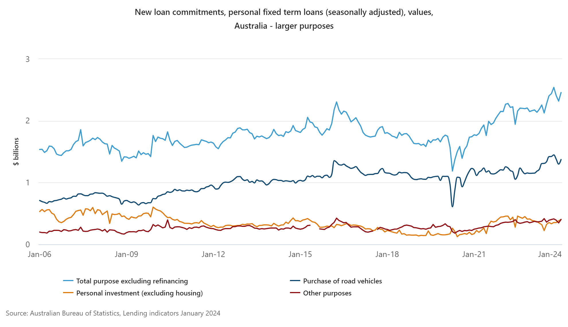
Chart 17: new loan commitments, personal fixed term loans (seasonally adjusted), Australia - large purposes; Source: Australian Bureau of Statistics
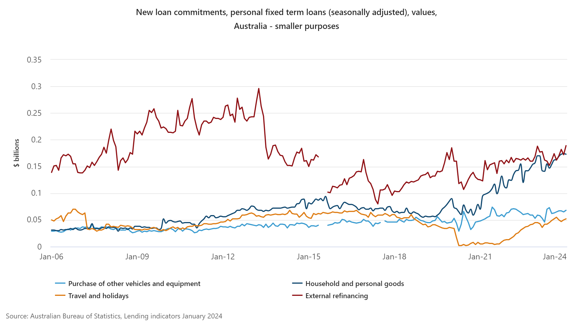
Chart 18: new loan commitments, personal fixed term loans (seasonally adjusted), Australia - smaller purposes; Source: Australian Bureau of Statistics
These dynamics show how a prolong and stubbornly high rate can cut even deeper into household finances.
What Needs to go Right?
From corporate cash flow, and small businesses’ health to household balance sheet, one significant factor is going to be the cash rate.
For consumers to start loosening the belt again, CreditWatch thinks that will take the job of at least 3 to 4 cuts in rates which it predicts, the earliest for the first being Q3 2024, which brings the belt losing to the early 2025 timeline.
Almost half of real estate professionals surveyed by CoreLogic predict a 1- 5% increase in property prices in 2024, with only 13% expecting more than than 5% (this is against a 8.9% increase in 2023).
Almost 60% of them believe a rise in rates have a deeper impact on real estate prices rather than a fall (at a 12% impact).
However they were not posed the question, “What if there were no rate cut in 2024, what would your expectation be for real estate prices?”
That shows the current mindset of consensus, and if rates do not travel according to this expected glidepath, in terms of timing and quantum, then both corporates as well as household balance sheets will be skirting on very thin lines of savings, high burden of liabilities, and on low growth prospects.
Cash While we Hold our Breath for Rate Cut
Despite the above, as investors, we currently continue to remain invested. As growth continues to be expected (though smaller from last year) from both the investment markets as well as properties and a surprise from cash rate is still possible.
As share prices trade towards the high range, ability to generate a decent level of income and cash flow into portfolios becomes more important. Depending on what asset classes you invest in, for equities investors, and if your risk profile suits, options writing will continue to be an important strategy, for both mild hedging as well as income potential.
For the purpose of education (with no advice given) let’s pick the underperformed energy sector (with earnings upgrade) to go long. One suitable candidate in the sector is Woodside Energy Group, WDS (last at $28.86). See the payoff diagram below for the selling of a Jun24 $29.01 strike put. This strategy earns an income upfront, in this case an estimated $1.00 for each share (3.4%) with no more further upside and downside unprotected. If one uses this strategy to purchase shares, the breakeven price will be $28.01.
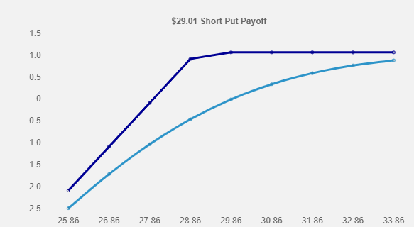
Diagram 1: Payoff diagram for selling WDST57
A continuous overlay of such options strategy over a portfolio of ASX shares can add income and smooth out volatility.