Stealthily Higher

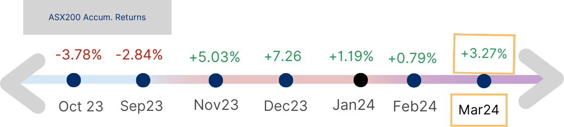
Figure 1: Stock Market Movement Scale
Acuview Mar 2024
As equities markets around the world climbed stealthily higher in March, we investigate if economic strength undergirds the Australian market. We take a bottom-up approach; starting from households to small and then listed businesses. How have they navigated the current higher inflation and interest rate environment, and what if conditions remain higher for longer?
Australian Households
How are households managing both sharply increased repayments and the cost of living?
Let’s take a look at valuable insights gleaned from the Reserve Bank of Australia’s (RBA) bi-annual December 2023 Financial Stability Review released recently in March of 2024.
a. Mortgage Repayments
Households had been able to make repayments, with very low percentage of arrears. They are dipping into savings and buffers to do so. Chart 1 shows the highest income group to be dipping the most into their prepayments (buffers and savings), with other income groups using less of prepayments and more of increasing hours of work or cutting down on other expenses of both.
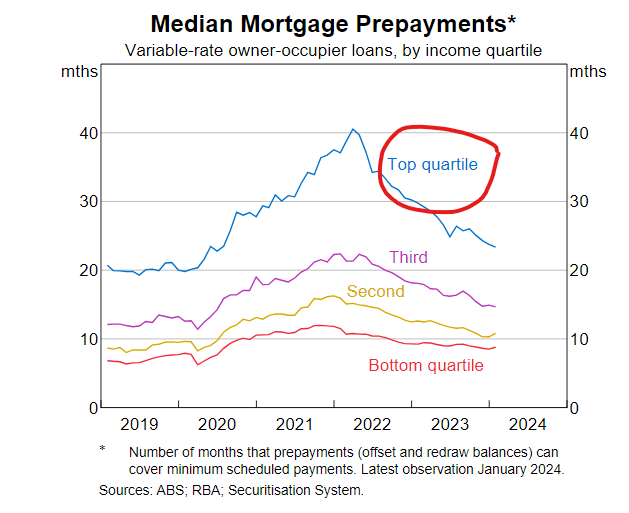
Chart 1 : Median Mortgage Prepayments
b. Low risk of arrears
It is found that borrowers with less than 6 months’ buffers in repayments have not increased and remain low, see Chart 2.
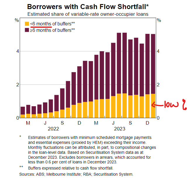
Chart 2: Borrowers with cash flow shortfall
c. LVRs, LTIs and default risk
LVR is the Ratio of the current Loan balance to the estimated current Value of the property mortgaged. Amid the expected low rate of arrears, the group with the highest risk of default is expected to be borrowers with LVR of 80% and higher.
The second highest risk group is an income measure, those with Loan to Income ratio (LTI) of higher than 4 times, which is about 11% of outstanding variable rate home loans. For example a household with a combined income of $100k and a loan balance of $500k is considered high risk.
These groups may have been identified as highest risk but they are still at under 2% and arrears past 90+ days are at a very low under 1%.
Households have been meeting repayments with low risk of default.
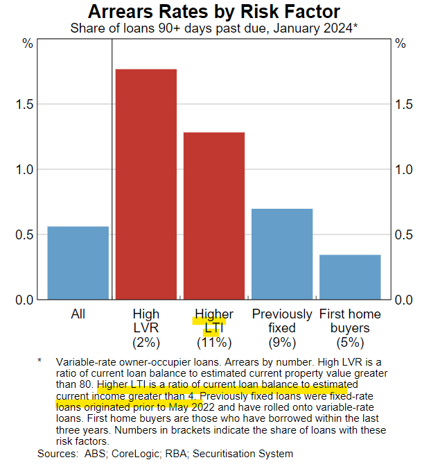
Chart 3: Arrears rates by risk factor
d. DTI and refinancing to lower repayments
The Debt to Income ratio estimates how much a borrower can borrow for a new loan. The measure is purpose-dependent. Though individual banks may have their own policies and RBA is yet to activate its restriction (though may happen later in 2024), the rule of thumb on the street is a DTI of 6 times income for a home loan or 7 times for investment properties.
These measures are widely adopted globally as in January this year, the Reserve Bank of NZ proposed to cap the number of loans above those respective DTIs to not more than 20% share of banks’ overall residential loan books. CBA commented in mid April of 2024 that Australia has one of the highest DTI in the world.
Since the first rate increase in May 2022, the percentage of new loans lent out at DTI greater than 6 times income had been falling fast. Chart 4 below shows its rapid descent since rate rise started. In its latest release in March 2024, APRA statistics* showed that the DTI trend for new loans has continued to fall, that is lending conditions had been tightening further. The level of debt allowed has been further crunched from 6.1% (in June 23) to 5.7% (Sep 23) and the latest Dec 23 quarter of 5.6%.
*Source: APRA quarterly authorised deposit-taking institution statistics dated 5 Sep 23, 5 Dec 23 and 12 Mar 24
This tightened lending measure is another reason for household cash squeeze as it prevents many mortgagors from refinancing to new lenders with lower rates.
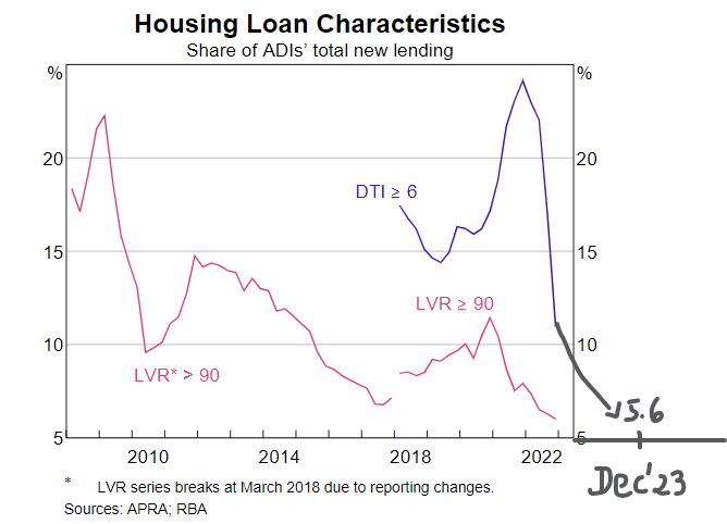
Chart 4: Housing Loan Characteristics
e. The key to the balance
This fine balance of Australian households tapping into its existing resources to fund increased loan repayments is predicated on one big factor, being employed. As long as employment is steady (which is RBA’s assumption to 2025) and income is coming into households, then this fine balance can be maintained, till rate cut arrives.
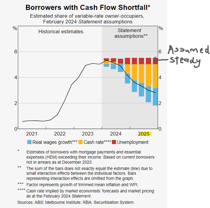
Chart 5: Borrowers with cash flow shortfall
Hence, the unemployment rate in Australia remains a key indicator that many economists keep watch of. As only a half percentage point rise in unemployment is all it takes to tip this finely balanced scale off-balance, pushing those most affected borrowers into cash flow shortfall.
This brings us to Australia’s unemployment rate, which has continued to fall and wages growing as depicted in the right side of Chart 6. A mix that is good for meeting repayments and the economy but not so good if we are holding out for a rate cut. This is why rate cut expectations have been pushed out, potentially until early 2025 from September 2024.
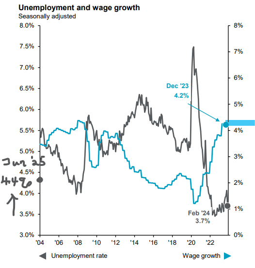
Chart 6: Unemployment and wages growth; Source: Factset, J.P. Morgan Asset Management, (Left) Australian Bureau of Statistics, (Right) ANZ-Indeed, National Australia Bank. Guide to the Markets - Australia. Data as of 12 April 2024.
Going forward, the unemployment rate is expected to gradually rise to and cap out at 4.4% by June 25 (left of Chart 6), with wages growth remaining steady to gradually trend moderately lower.
Whilst the RBA may be “happy” at status quo and leaving natural forces to do its work, Charts 7 and 8 below show consumers that are less than “happy campers”. Consumer Sentiment Index remains very low as debt servicing ratio of household income continue to be elevated.
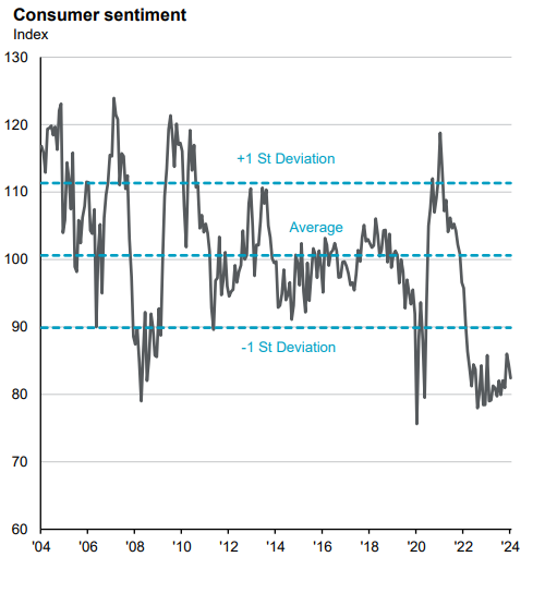
Chart 7: Consumer sentiment; Source: ABS, Factset, Westpac, JP Morgan Asset Management. Guide to the Markets - Australia. Data as at 12 April 2024.
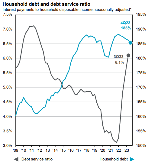
Chart 8: Household debt and debt service ratio; Source: Australian Bureau of Statistics, BEA, FactSet, Reserve Bank of Australia, J.P. Morgan Asset Management. *Interest charged on total housing loans relative to household disposable income. Guide to the Markets – Australia. Data as of 12 April 2024.
Businesses
a. Business Confidence
NAB’s Monthly Business Survey (the latest of March 2024) gives good insights into businesses’ confidence and conditions.
The latest takeaways for March 2024 were improved business confidence (red line, Chart 9) (though still below long-term average) despite business conditions (-1 point black line of Chart 9) not yet improving.

Chart 9: Confidence and Conditions (Net Balance, Seasonally Adjusted); Source: NAB Monthly Business Survey, Mar 2024
Breaking down components of business conditions showed both Trading and Employment being steady (from months of falling) amid a 4 point drop in Profitability (Chart 10, black line).
Did confidence improve because businesses are beginning to glipmse the end of the tunnel?
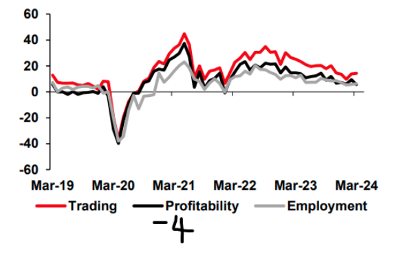
Chart 10: Components of Conditions, SA (Net Balance); Source: NAB Monthly Business Survey, Mar 2024
RBA has also advised from Chart 11 that the profit margin crunch is mostly felt by smaller businesses and more so in retail, accommodation and food. Other industries, especially listed ASX companies are still generating decent profit margins.
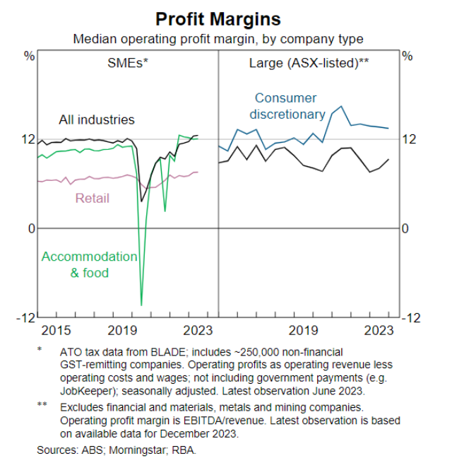
Chart 11: Profit Margins; Source: RBA
It may be still at low levels as seen from Chart 12 but activities are improving. The Forward Orders Indicator rose 3 points in March 2024.
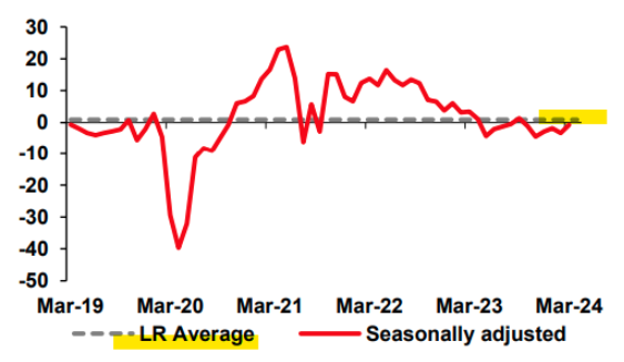
Chart 12: Forward Orders, Seasonally Adjusted (Net Balance); Source: NAB Monthly Business Survey, Mar 2024
As depicted in charts above, the impact of rate rises on businesses varies, certain sectors like retail and personal services are hardest hit in the small and medium-sized enterprises (SMEs) space. Borrowers who are SMEs face the added burden of higher interest repayments and cash flow crunches, as shown in Chart 13.
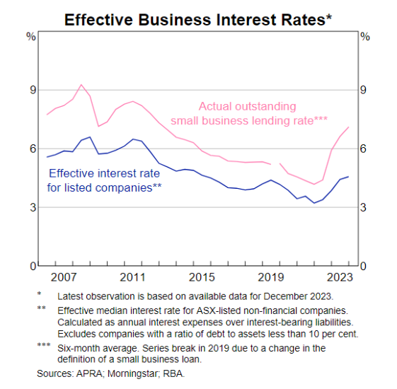
Chart 13: Effective business interest rates; Source: RBA
The gradual increase and rebound in private credit (as shown in Chart 14, rising by 0.5% in February 2024) can be attributed to the stringent lending standards of traditional banks and the gaps in lending they have created. Some investors are turning towards this alternative asset class to boost income in their portfolios, which could be a subject for future discussion.
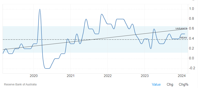
Chart 14: Australian Private Sector Credit, April 2024; Source: Trading Economics, RBA
A key takeaway is that the poorer conditions of these certain segments are unlikely to cause a contagion effect or wider financial stress, even with a 50bp increase in rates (which is not a forecasted scenario but more of a stress test by the RBA). According to RBA’s stress test of resilience, even if inflation and rates were to stay higher longer (with a 50bp higher rate), cash flow crunch of households are expected to peak around 6% by mid June this year and gradually subside from there.
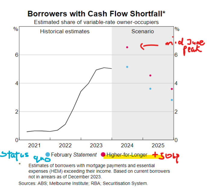
Chart 15: Borrowers with cash flow shortfall; Source: RBA
RBA is further comforted by listed companies’ generally unstretched gearing levels and their above median cash holdings as seen in Chart 15 which are healthily above the pre-pandemic level, and ICR (interest cover ratio) of above 2.
For listed companies with interest expense cover of less than 2 times income (ICR<2), they are found to have undemandingly low gearing ratios. Even with a higher for longer 50bp increase in interest rate, they do not have the risk of default as seen in Chart 17.
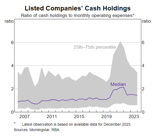
Chart 16: Listed Companies cash Holdingsl; Source: RBA
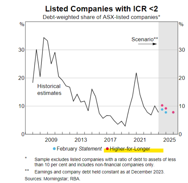
Chart 17: Listed companies with ICR<2
In summary, as unemployment stabilises and inflation persists for an extended period (projected till end of 2025), households and businesses that have shown resilience for the past two years are expected to continue to do so till rate relief arrives.
War and Euphoria?
War and Euphoria? They don't seem to read quite well in the same sentence.
“Euphoria” was used to describe/measure investors’ sentiment towards stocks in early April, as indicated by Chart 18 showing Citi Group’s widely observed Levkowich Index. This is echoed by another Investor Sentiment Index (a survey conducted by American Association of Individual Investors for the week ending 10 April at Chart 19) depicting “Bullish” temperature and above historical level.
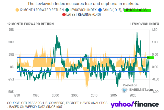
Chart 18: The Levkovich Index, dated Apr 2 2024; Source: Isabelnet.com

Chart 19: AAII Investor Sentiment Index, week ending 10 April 2024
As April rolled on, geopolitical risk moved up the Risk Table when Iran launched a barrage of drones and missiles on Israel.
In the current month of April (17 April 24), S&P/ASX 200 has come off -3.7%, S&P500 -4.42%, Dow Jones -5.16% and Nasdaq -4.25%, a combination of some money being taken off the equities table and the 13 Apr barrage. Chart 20 highlights though that gold has continued to rise (a trend that was already in motion) and there was not a blip on oil price from the 13 April event.
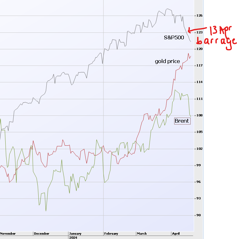
Chart 20: Common base S&P500, GOLDNY.ID, BRENT.IF 18 April 2024; Source: IRESS
Geopolitical events have the potential of triggering oil shocks, especially with Iran currently accounting for 3% of world consumption. Observing Chart 21 highlights the fact that oil price had been rising in the past few months (from a more robust US economy and the bottoming of global manufacturing cycle) and was not further induced by the recent geopolitical event, instead it experienced small reversals since.
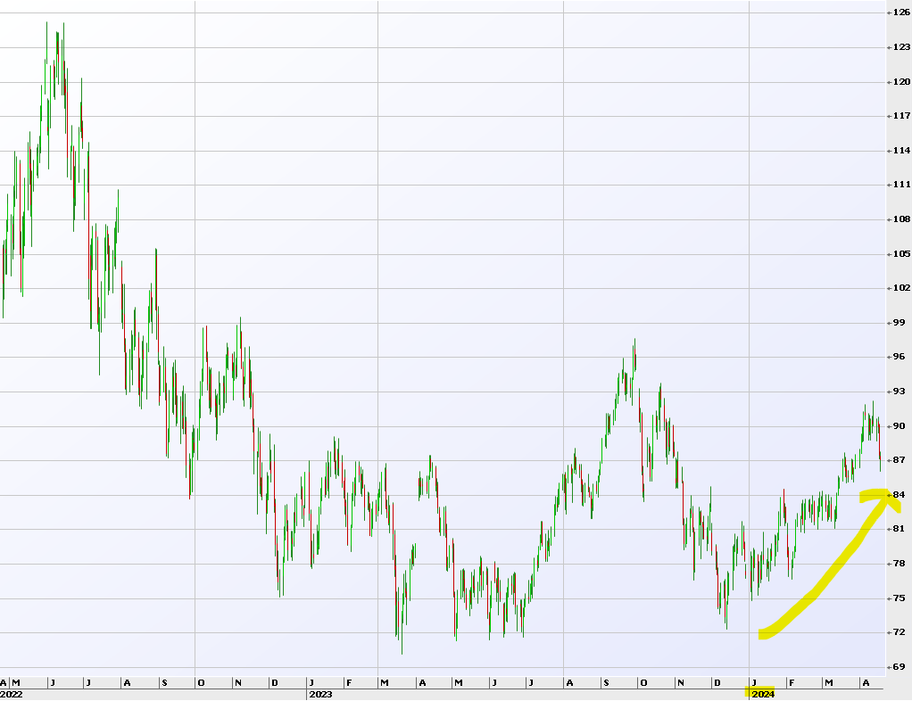
Chart 21: BRENT.IF 18 April 2024; Source: IRESS
As events develop, we continue to assess the risk of escalation and its implication to oil price (and inflation) and the broader investment market. The pulse now is more of caution and not of nervousness.
Table 1 below lists the top and bottom 3 sectors of the S&P/ASX 200 in the past 12 months from percentage gains and losses.
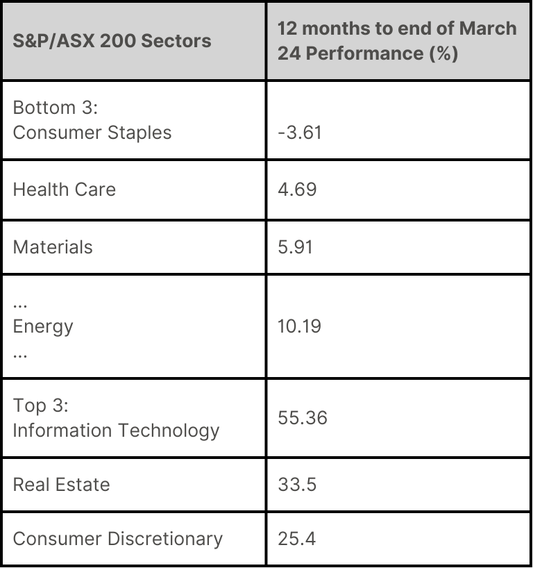
Table 1: S&P/ASX200 Australia and New Zealand Dashboard; Source: S&P DJI 28 Mar 2024
The Energy and Materials sectors were the weaker performers (though not the worst). Chart 22 below shows the Industrial Metals Index in a recovery mode since the beginning of this year and in April, moved up as overall equity indices fall. This can potentially be an interesting dynamic for portfolio hedging.
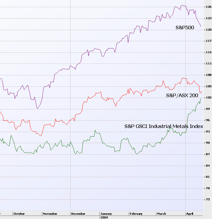
Chart 22: Common base S&P500, XJOAI and SPGSIN.SPII; Source: IRESS
What portfolio strategy should we consider amidst the current wait-and-see market sentiment, especially with asset prices hovering near the upper end of the range? It’s known that the selling out, sitting on cash, and waiting strategy can cost. How about the alternative of raising some cash and increasing earnings by holding on to both the cash and strong core stocks?
For wholesale investors utilising derivatives in a well-managed direct equities portfolio, the most effective strategy at the moment is selling strangles over large-cap stocks, especially Material stocks that are rebounding from their lows but not yet their peak (Chart 22).
Selling covered strangles allows for generating income from both puts and calls while maintaining the security of holding on to stocks and having available cash to potentially buy stocks at prices below current levels. It’s an effective strategy in the current market conditions.
Please note: This is not trading advice nor a recommendation. Please seek professional advice. It is intended for educational purposes only. If you require further information or education on the topic, feel free to get in touch.